… some of us would go and dissect them, in all bastion of gloriously esoteric nerdery.
Science fiction movies are a very interesting domain — all the promise of this big bold, future of hovercars and robot butlers and many more. Sci-fi is almost as old as cinema itself, starting with 1902’s Georges Méliès’ “A Trip To The Moon” being the first example, but the scene is magnified in late 20th century filmmaking following the aftermath of “Star Wars”.
In a few previous posts, we talked about fantasy user interfaces, gestural interactions in sci-fi interfaces and a collection of user interfaces in sci-fi movies. This post, we look at the collection of typesets, corridors and what we would wear in the future if classic sci-fi films got it right.
The future’s fontspotter

David Addey’s obsession with science fiction does not stop with just watching them. He has eyes keen enough to spot that there was a same font in every movie he had watched: Eurostile Bold Extended. The font, designed in 1960, is geometric, functional, and looks good on the side of a spaceship in “Star Trek”, a computer screen in “Wall-E” or the wall of a multinational corporation in “RoboCop”.
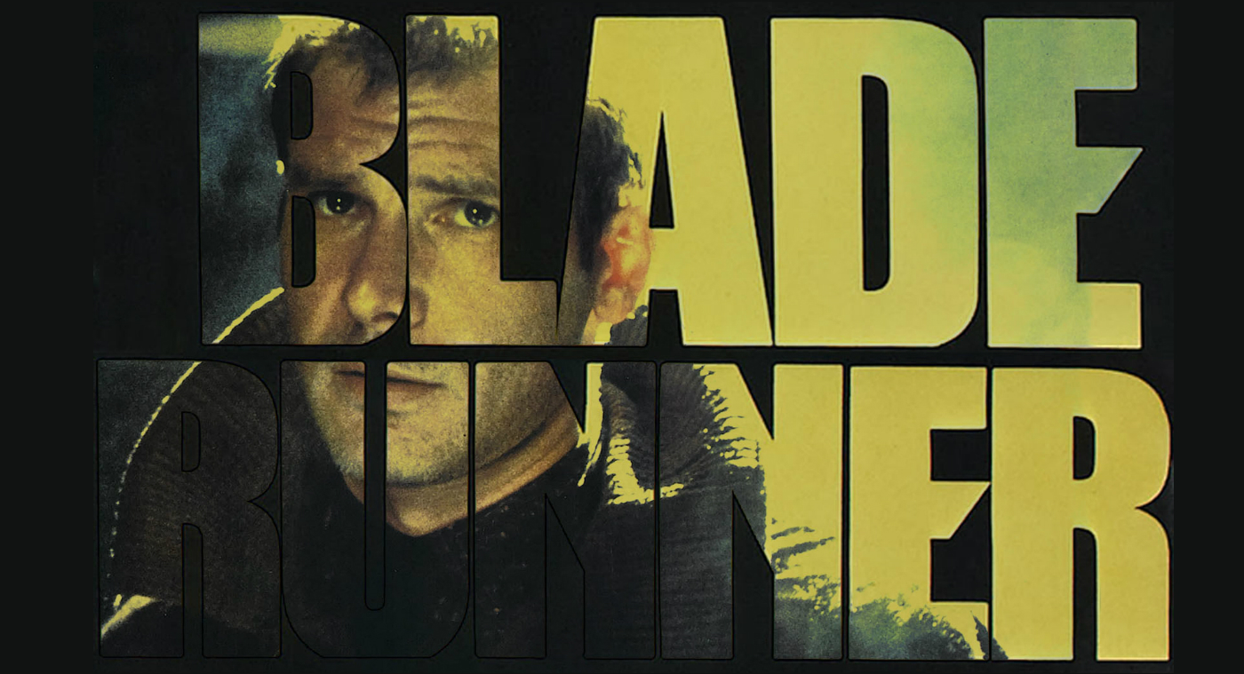
After he realised this was something he could no longer unsee, Addey launched his own website, Typeset In The Future, a website devoted entirely to fonts in science fiction, featuring exhaustive exegeses of the type and symbols in science fiction movies. Who would have known that in “2001: A Space Odyssey”, the spacecraft’s hibernation devices “use Futura for their numeric and medical buttons, and Univers for their Emergency Revival Procedures,” or that in “Blade Runner”, the typeface used as the frontage of Los Angeles’ iconic Bradbury building, a “very lovely Berthold Block Heavy,” isn’t, in fact, the font used on the entrance of the actual building.

If you’d love to read more about Addey’s analyses, check out Typeset in The Future.
Walking round the aisle

Corridor of Planet of the Apes (2001, Tim Burton)
Spanish artist Serafín Álvarez began collecting her favourite corridors from sci-fi and other movies three years ago and organized them into an online archive, with 127 pages of screenshots and counting, in a tumblr called Sci-Fi Corridor Archive.

This infatuation is further expounded — she has now made some 3D reproductions of some of the corridors and put them in a game, called Maze Walkthrough, so you could wander around the corridors from your favourite sci-fi movies! In it, players might explore the blaster-scarred walls of the Death Star before descending down a ladder to the living quarters from Discovery One, the ship in “2001: A Space Odyssey”.
Download the game here.
Dressed to the nines, and beyond

Blade Runner (1982)
Alongside production design, costume plays a key role in creating worlds and characters that support stories of future societies, space travel and fantastic other worlds and galaxies.
Designers and directors have taken a range of approaches to fashioning the future, from the creation of pristine and functional utopias in films such as Things to Come (1936), to decidedly well-worn future cities that mesh elements of old and new, as in Blade Runner (1982). But in all cases, good costume design works with every element of a film to help viewers believe in the overall reality of what is presented on screen.

Here’s a selection of images of a few key design trends in sci-fi costume designs, drawn from the collections of the BFI National Archive’s Special Collections — showcasing the dystopian vision of “Metropolis”‘ (1927) of the oppressing future society, the influence of Japanese culture in Obi Wan Kenobi’s Jedi robe, as well as implementing pink and street fashions in 1982’s “Blade Runner”.
No such thing as too obsessed
Obsession isn’t always an unhealthy thing, especially if you are up analysing things like typography & iconography, as well as building cool things which enables people to realise their dreams of walking around their favourite sci-fi corridors — then all of us are aboard nerd heaven!
Credits:
 Stampede Design
