

Welcome to Curated Friday! This week we take a look at (somewhat) style guide for European cities and the relationship you have with your devices – to what extent can we consider productive or addictive? Also, what would happen if a digital camera was never invented?
This week in films and movies
“There are two types of beings in this universe, those who dance and those who don’t…”
Be prepared for Groot awakening – the first sneak-peek for next summer’s Guardians of the Galaxy Vol. 2 is here. Although the trailer is barely a minute a half, we are excited to see as the team is ready to traverse the outer reaches of the cosmos as old foes become allies and characters from its comics are ready to come to the heroes’ aids in this second installment in this Marvel Cinematic Universe.
Also, baby Groot makes an appearance! Time to get hooked on a feeling.

This week in architecture & urban design
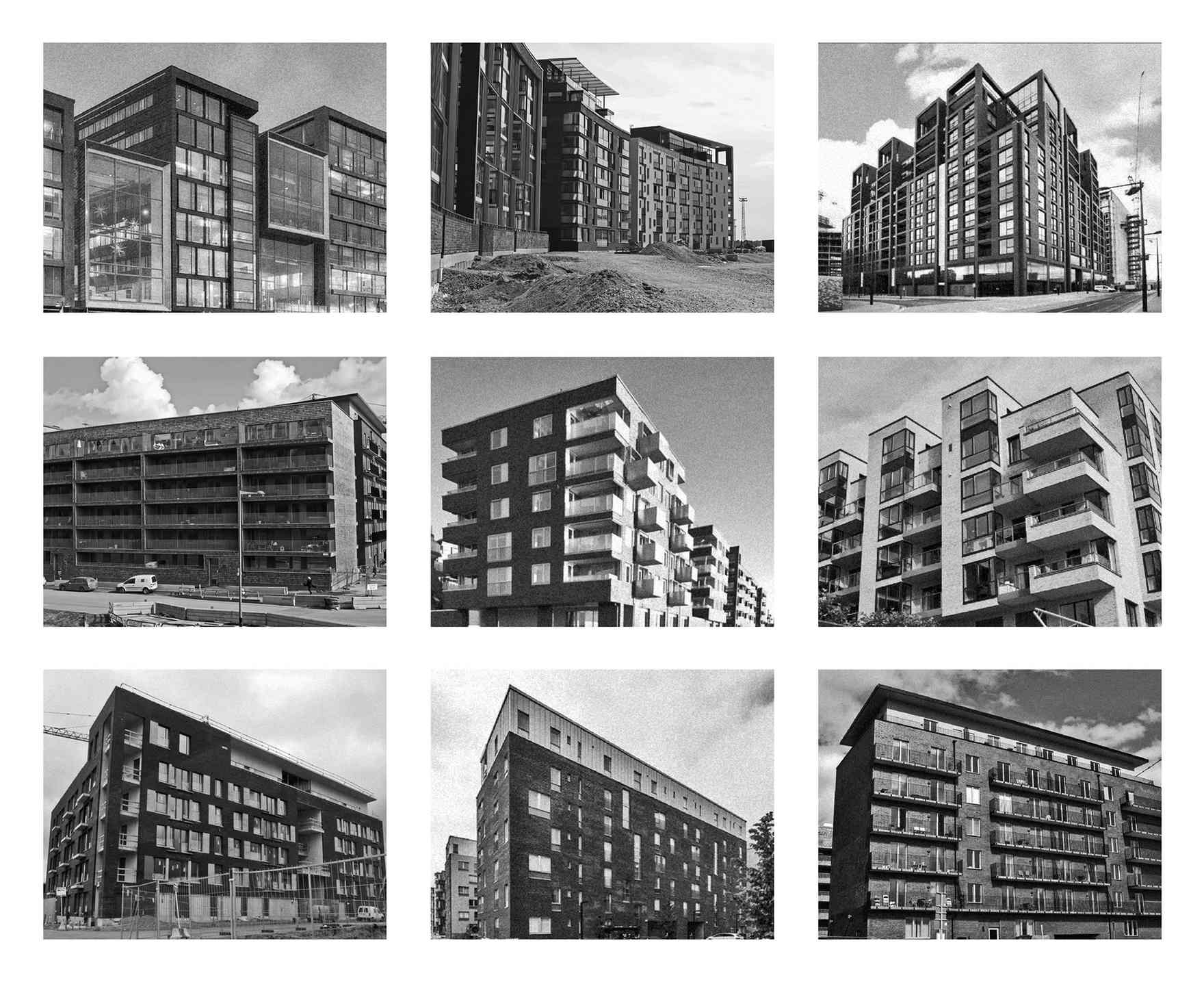
Top: Oslo (Fjord City), Helsinki (Jätkäsaari), London (Kings Cross). Middle: Stockholm (Royal Seaport), Oslo (Fjord City), Hamburg (HafenCity). Bottom: Helsinki (Kalasatama), Helsinki (Jätkäsaari), Stockholm (Royal Seaport)
Are cities looking more alike? Has strolling Helsinki’s new neighbourhood Jätkäsaari become an extension of walking along a path of London’s Kings Cross redevelopment zone? If so, how are these developments collectively shaping the experience of the city?
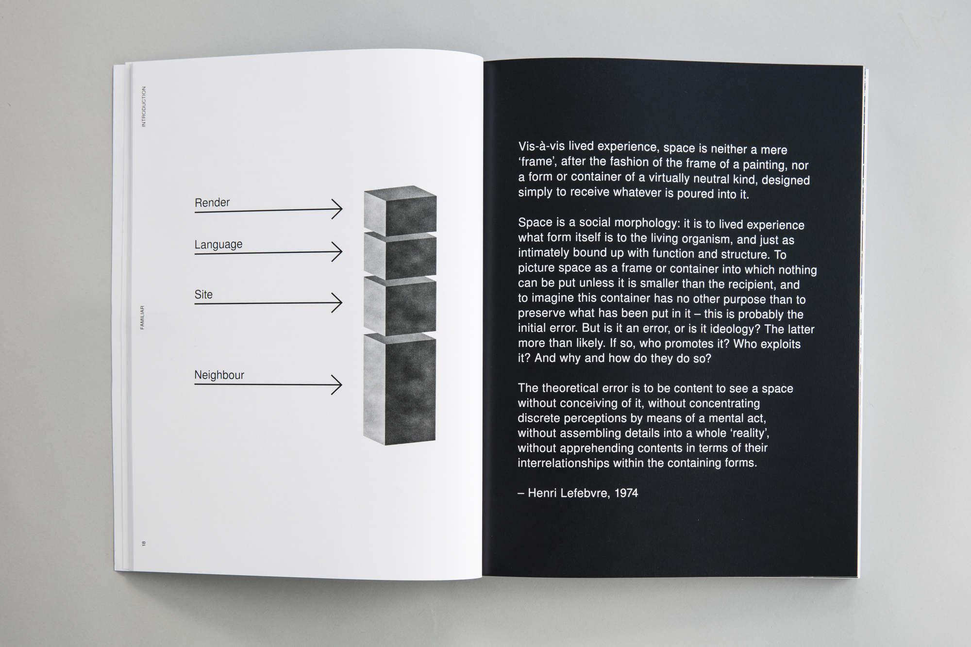
In his project Familiar, designer Luca Picardi examines existing marketing material for new developments in North Europe – from London to Malmö, Hamburg to Helsinki – to highlight their striking similarities. From newly built blocks of flats in London to plaza squares in Stockholm, Picardi archives what he calls “the age of the familiar.” Renders, architecture, even the marketing jargon and placemaking methods, the book is a record of how uniform these strategies can turn out to be.
What’s even more interesting was this idea was born out of a walk – Picardi was documenting the cities for his residency at the British Council for Helsinki Design Week. “I found the experience of wandering around Helsinki’s new neighborhoods Jatkasaari and Kalasatama in Helsinki eerily familiar to exploring some of London’s latest regenerated areas such as Nine Elms and Kings Cross.” Picardi tells The Creators Project. This triggered an urge to understand the extent of which developers are duplicating swaths of cities on a larger scale. Eventually the scope of the study spanned London, Stockholm, Copenhagen, Hamburg, Oslo, and Helsinki.”
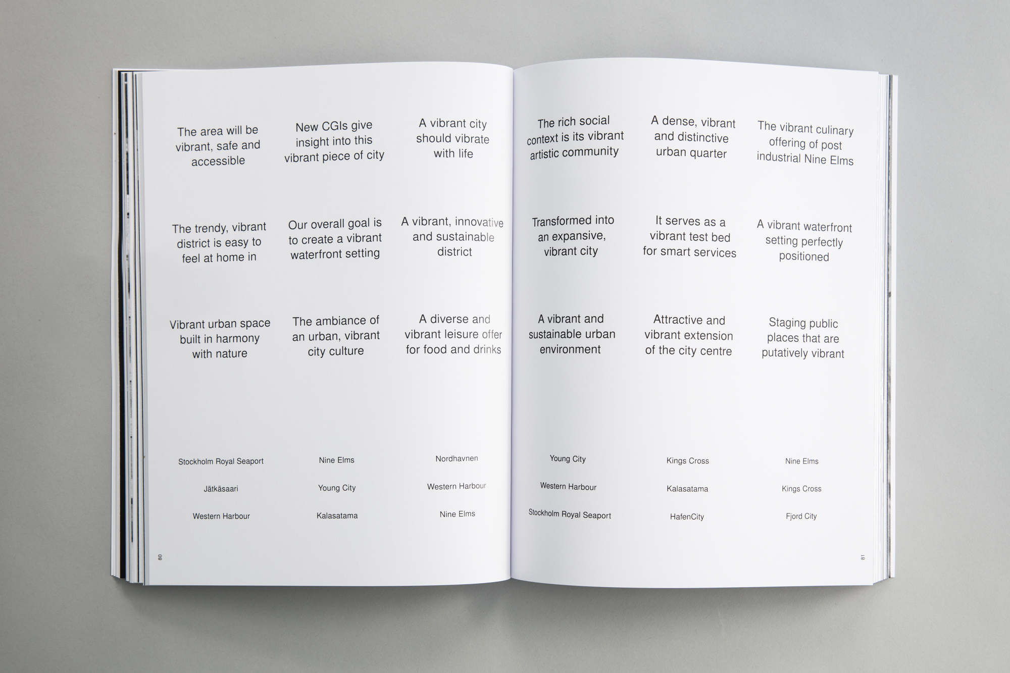
So if you’re strolling along European cities and you notice they all looked somewhat weirdly familiar, you are not alone.
This week in product design
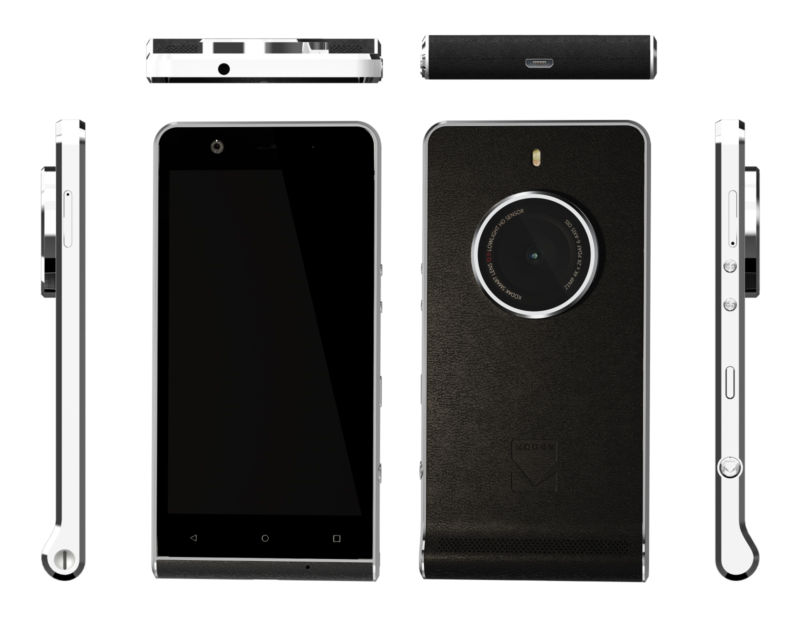
After so many years, Camera maker Kodak is making a new play: the Android smartphone market. The mighty American photography company is hoping for a revival with the launch of Kodak Ektra, a smartphone named after its iconic 1940s rangefinder Ektra camera.
Tim Sheppard, head of applications and market intelligence at Bullit, which oversaw the creation of the phone, told WIRED the £449 device is “not a mass market play”. According to Shepard, the phone is “designed for photographers” and will interest “hundreds of thousands” of people in the UK rather than millions. WIRED also gave a hands-on review to the camera, which is covered here in this link.
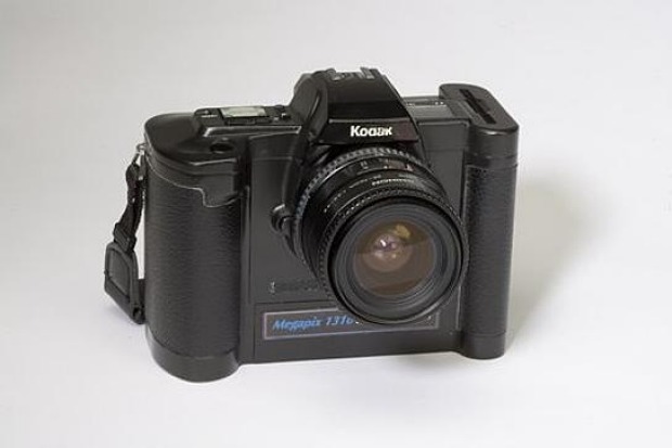
The 1989 version of the digital camera, known as the Ecam (electronic camera). This is the basis of the United States patent issued on May 14, 1991.
Also, how’s this for butterfly effect? In 1975, a Kodak employee invented the digital camera. Then his bosses made him hide it. Ever wonder how it would turn out if it’s hidden – forever?
This week in UI/UX
It was an interesting question brought up by James Greig the other day:
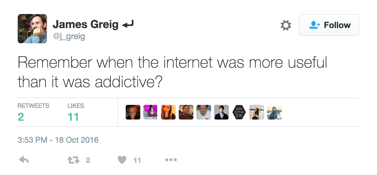
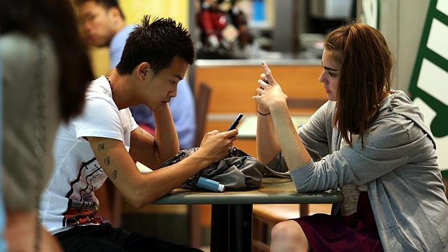
It prompted so many questions about the relationship you have with Internet, your mobile devices, at what point you realise it had become such an unhealthy addiction and how you claim your agency back in the world of constant notifications.
If you have been wondering why you can’t put down your phone, surprise (or no surprise at all) that it’s all by design. In this article by New York Times, it is mentioned that the same design qualities that make an app enthralling, he said, may also make it difficult for people to put down. And the more popular such services become, the more appeal they hold for users — a phenomenon known as the network effect – it’s like yawning in a room full of people.
“Once people come in, then the network effect kicks in and there’s an overload of content. People click around. There’s always another hashtag to click on,” Greg Hochmuth, former Instagram software engineer told. “Then it takes on its own life, like an organism, and people can become obsessive.”

“Network Effect” explores the psychological implications of popular digital services and features 10,000 clips of people engaging in various activities.
Now Hochmuth and Jonathan Harris, an artist and computer scientist, have collaborated on a project that explores the implications of such compelling digital platforms for the human psyche. Titled “Network Effect,” the site invites users to click through a video and audio smorgasbord of human behavior.
Design thinker Tristan Harris wrote a very insightful article on how tech companies intentionally design your life to make it seems that you are always dependent on them – and that is up to us to claim our agency back.
Until now, with this experience of distraction, social media, and this vague sense that we don’t feel good when we use our phones for too long, there’s been nothing to rally behind. It’s too diffuse. We receive so many incredible benefits from tech, but we’ve also been feeling like we’ve been losing ourselves, and our humanity?
What’s at stake is our Agency. Our ability to live the lives we want to live, choose the way we want to choose, and relate to others the way we want to relate to them – through technology. This is a design problem, not just a personal responsibility problem.
If you want your Agency, you need to tell these companies that that’s what you want from them– not just another shiny new phone that overloads our psychological vulnerabilities.
Yet another brilliant piece by Harris in the Atlantic – the biggest obstacle to incorporating ethical design and “agency” is not technical complexity.
Tech companies can help too. In the world of constant push notifications and perpetual feedback elicitations (e.g. would you like to rate this app?) app designers can do their part by providing effective notifications.
Today, the beeps, buzzes, rings, flags, pushes, and pings blasting from our phones prompt a similar response. They’re the Pavlovian bell of the 21st century and, instead of making our mouths water, they push us to check our tech incessantly, inducing anxiety. Nir Eyal of Invisionapp has written a timely article on the 3 laws of effective notifications in order to elevate this:
- Good notifications are timed
- Good notifications inspire action
- Good notifications create intrigue
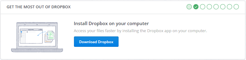
Another related read – designing for short attention span, using Dropbox’s and LinkedIn’s progress meters to help with small steps towards completion.
To conclude this section, again in words by Tristan Harris, “We need our smartphones, notifications screens and web browsers to be exoskeletons for our minds and interpersonal relationships that put our values, not our impulses, first. People’s time is valuable. And we should protect it with the same rigor as privacy and other digital rights.”
This concludes Curated Friday of the week. If you have any suggestions for design news and topics, feel free to drop an email to zana@stampede-design.com. Till next week!