

Welcome to Curated Friday! If you have never heard of Zen Pencils, it is an exciting and unique new comic form that takes inspirational and famous quotations and adapts them into graphic stories.
Gavin Aung Than’s cartoons features quotes from legendary folks of the world such as Carl Sagan, Rainer Maria Rilke, Rumi, Frida Kahlo and many more. It is very heartwarming and motivational like no other.
Meanwhile, in this week’s Curated Friday, we took a look at London Underground’s new typeface and the hype (as well as dissatisfactions) surrounding it, and the wonderful world of gestural interfaces inspired from sci-fi, among others.
This week in design
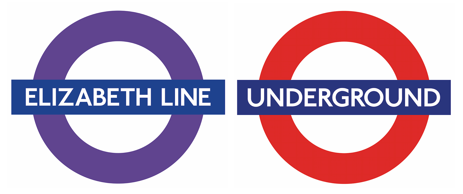
Johnston100 on the Elizabeth Line and Underground roundels.
This July, Transport for London (TfL) will roll out a redesign to Johnston, the typeface that’s decorated the London Underground since 1916. The newest iteration is called Johnston100. Designed by type foundry Monotype, it’s the first update to the typeface since the late 1970s, when it was adjusted for new typesetting technology.
The Johnston typeface, designed by Edward Johnston in 1915, is almost singlehandedly revived the sans serif. “Johnston is not just our typeface,” says Mike Ashworth, London Underground’s Design and Heritage Manager, “It is the very typeface of London. You will find no Londoner who does not recognise it, nor the simplicity and authority Johnston brings to this city.”
The Johnston100 includes just “subtle changes to make it fit for purpose in the 21st century“. Retaining the soul of the original lettering, extra-thin weights of the typeface have been created so that the same lettering can be used for mobiles as in stations, as well as new symbols as the hashtag and “at” sign.
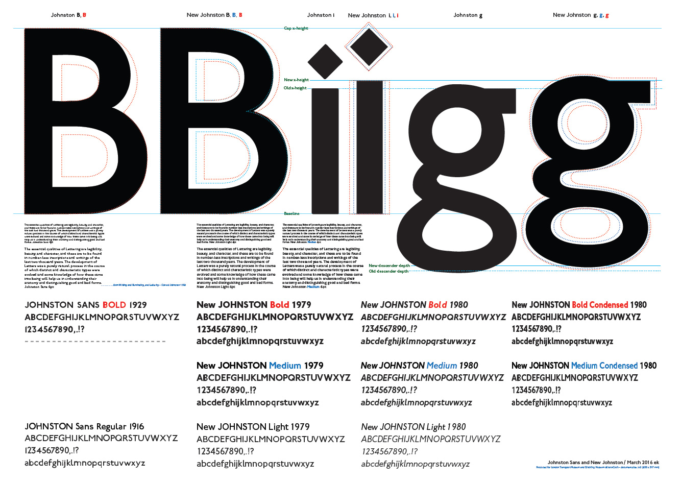
“New Johnston” compared (credit to London Reconnections)
This week in music
The latest Chemical Brothers promo video Wide Open (feat. Beck) caught our eyes this week. Featuring a woman dancing around a warehouse space as parts of her body are revealed as 3D-printed lattice constructions, it is said to be shot in one four and a half minute shot. One single shot.
Produced by The Mill London, collaborating with directing duo Dom & Nic, the video incorporates 6,800 frames, implements meticulous tracking, mocap data and even a bespoke tool for producing clean plates to make the promo possible.
Check out this interview with the key members of The Mill on the making of this incredible video.
This week in art
How would you feel when you walk in an art exhibition and you see yourself as part of it? Artist Rafael Lozano-Hemmer decides to let viewers participate in his installation when he set up an immersive projection on three walls, fed by 12 computerised surveillance systems trained on the public. The piece uses face recognition algorithms to detect the presence of participants and record their spatial relationship within the exhibition space.
Originally conceived for the Architecture Biennale in Beijing but only realized for Lozano-Hemmer’s current solo exhibition in Mexico City’s MUAC Museum, Zoom Pavilion marks the first collaboration between the artist and fellow artist Krzysztof Wodiczko, known for his is large-scale slide and video projections on architectural facades and monuments such as the one in Hirshhorn Museum in Washington, D.C.
This week in UI/UX
As an extension on last week’s UI/UX Curated Friday feature for fantasy user interfaces, we take a look at how much gestural interfaces has influenced sci-fi movies. One of the most famous interfaces in sci-fi is gestural — the precog scrubber interface used by the Precrime police force in Minority Report. Using this interface, Detective John Anderton uses gestures to “scrub” through the video-like precognitive visions of psychic triplets. After observing a future crime, Anderton rushes to the scene to prevent it and arrest the would-be perpetrator. Smashing Magazine has published this article in 2013 – old but still gold – lessons on what designers can learn about gestural interactions in sci-fi interfaces.
The Martian UI work by the ever incredible Territory Studio
Also, imagine our delight when we stumbled upon Science Fiction Interfaces tumblr, a project compiled by designer Seena Burns, featuring so many examples of interfaces from movies such as Star Wars, The Martian, The Avengers: Age of Ultron, and many more.
This concludes Curated Friday of the week. If you have any suggestions for design news and topics, feel free to drop an email to zana@stampede-design.com. Till next week!