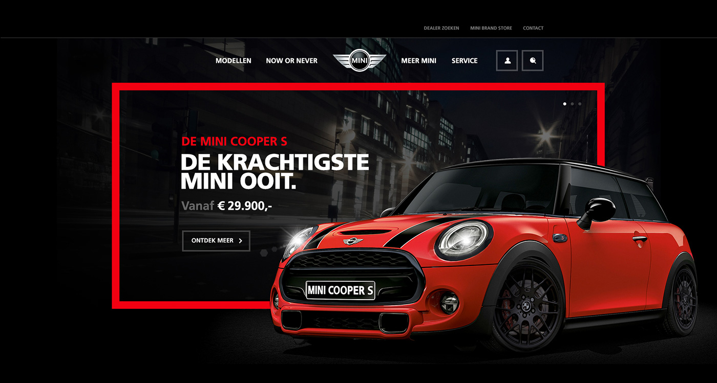
I am loving this MINI homepage design concept by Tom Arends, Graphic Designer and Creative Director a Blink Interactive. He designs this concept with big rectangles and photography, channeling his love with the brand and the MINI identity.
The main image is the most attractive part. It looks like a billboard and the car in front of it makes it look alive and nicely done. The dust effect at the tyre shows as if the car just arrived at its destination.
The MINI WALL is also the unique part in this design concept. The images put up there are not like any usual images in showroom, it shows how the car looks like in the real world and the carousel could slide in from the right side. Awesome!
 Stampede Design


