Wired
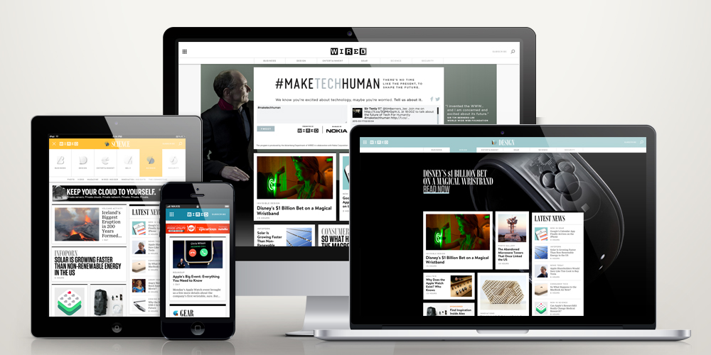
This has been US Wired site’s first redesign since 2007. The goal is to create a clean and gratifying experience through a clutter-free site. The new site works well across devices and screens of all sizes, suitable for generally very digital-savvy readers.
The new site was built on a single code base, a platform that is able to continuously innovate and improvise while maintaining a very high degree of storytelling fidelity. From the bespoke typefaces to the streamlined wayfinding, every aspect of the new WIRED.com has been obsessed over.
Check out the new Wired here.
 Stampede Design

