Welcome to Curated Friday! This week we take a look at the history of Olympics logos, an analysis of 67 years of Lego bricks along with the state of ugliness that works, among others.
This week in film and movies
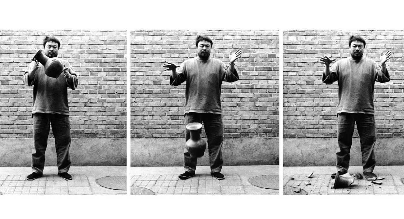
Since the weekend is coming up, here is an extensive list of documentaries every designer should watch, featuring Gary Hustwitts’ Helvetica and Urbanized, Mu ming Tsai’s Design & Thinking and Never Sorry, a story on artist Ai Wei Wei.
More than about design, the films in this list should be able to teach about people – how they behave, what motivates them and how they shape art and culture, while at the same time having their behaviours shaped by art and culture.
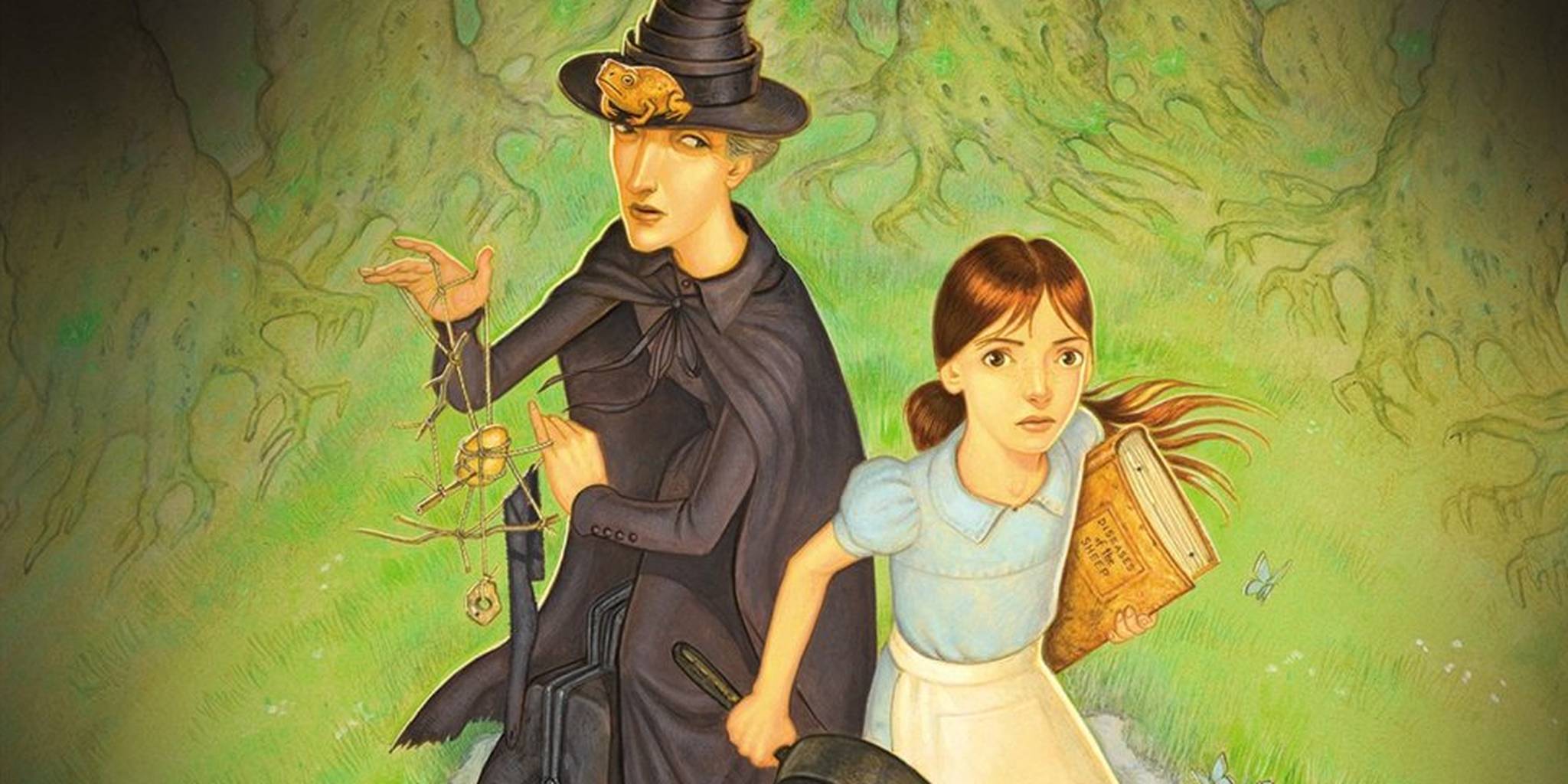
At the same time we are also excited to hear that there is going to be movie on Terry Pratchett’s young adult novel The Wee Free Men. Even more exciting that it is going to be produced by the Jim Henson Company, creators of The Muppets and the 1986 film Labyrinth, which starred David Bowie. The 2003 novel will also be adapted by the author’s daughter, Rhianna Pratchett, who had been a longtime fan of the Jim Henson Company’s work.
The Wee Free Men introduced Tiffany Aching, the young witch who starred in several of Pratchett’s last Discworld books. It also features a group of Discworld characters who seem absolutely perfect for a Jim Henson movie: the Nac Mac Feegle, a community of foul-mouthed and gleefully violent gnomes.
This week in graphic design
With the Rio Olympics now in full swing, Dezeen has decided to round up some of the best and worst logos that have been produced to promote the summer event, including the favourite logos selected by legendary graphic designer Milton Glaser and critic Alice Rawsthorn.
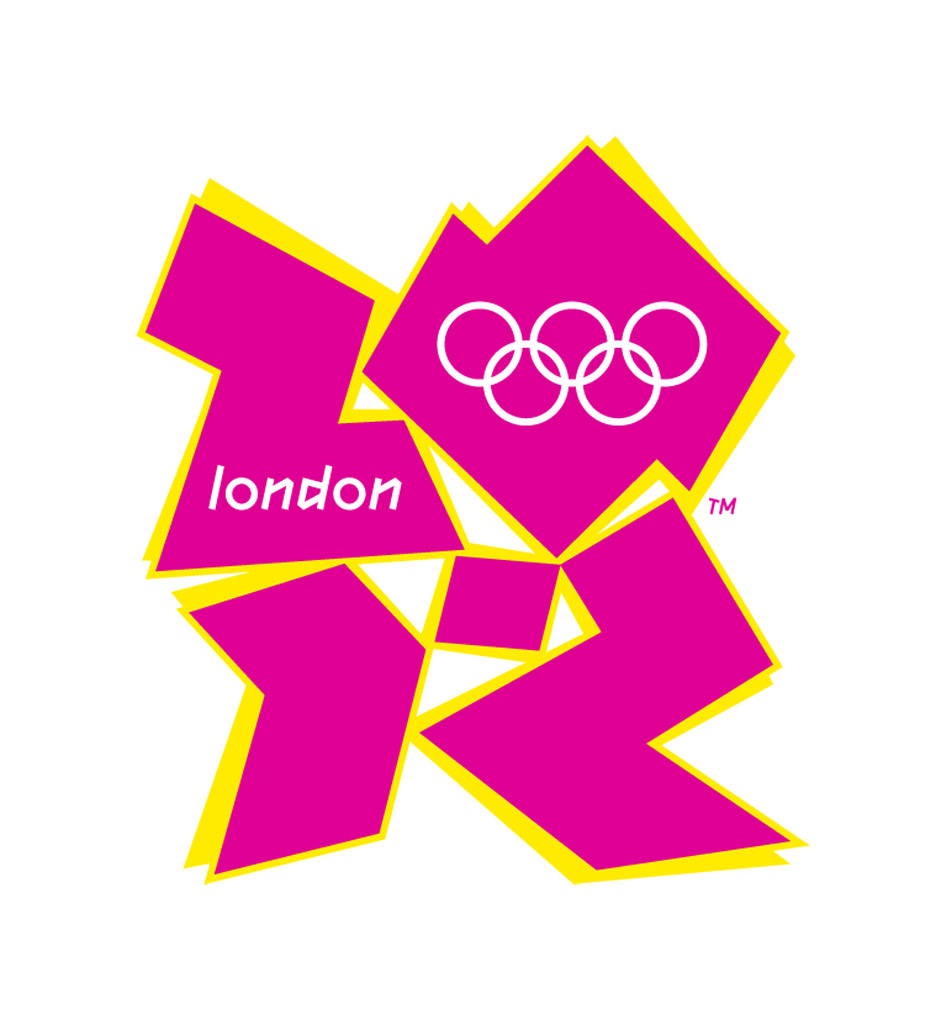
This includes the controversial £400,000 London 2012 logo, created by Wollf Olins, which was created with the intention to be highly visible on screens. “I felt then – and still feel now – that the 2012 logo was memorable for the wrong reasons, because it looked to garish with its clumsy typography and garish shapes,” wrote Rawsthorn on Instagram.
Nevertheless, it is amazing to see the development of logo for the Olympics games, starting from Munich 1972’s application of modernism, more colour application in Sydney 2000’s games, adoption of cultural elements for Beijing 2008 to full transformation in London 2012.
This week in product design
For Lego bricks fans, nothing is too small a task. This is not limited to building simple to complicated things using the bricks, but will also include conducting an elaborate analysis of Lego sets for the past 67 years.
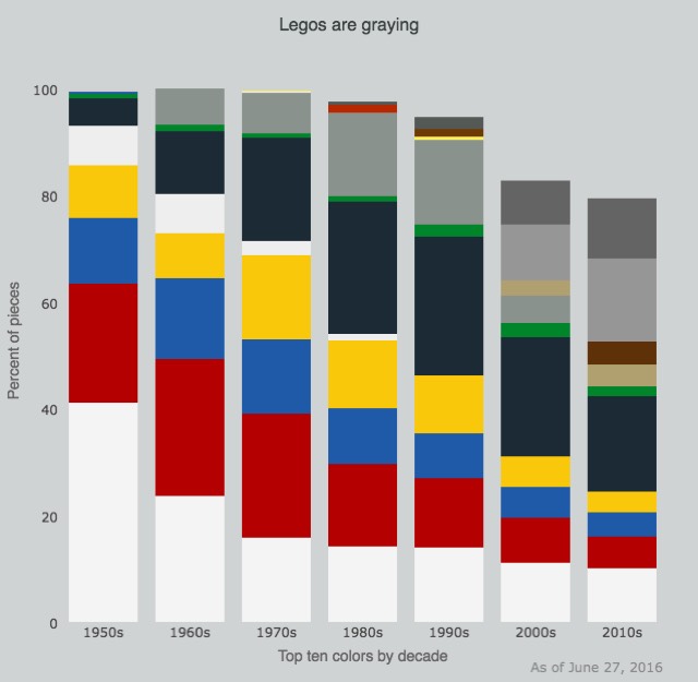
Life-long Lego fan Joel Carron did just that. He recently analysed a data set containing the types, colors, and number of pieces in every Lego set from the past 67 years and graphed the results. One of the striking results? Legos are greying.
Take a look at his full analysis here.
This week in UI/UX & design thinking
Upon browsing Reddit or Wikipedia, have you ever thought how, in today’s state of user interfaces, their interfaces would have been regarded as ugly? Yet, you keep coming back.

Designer Graeme Fulton explores on the state of ugliness that works, focusing on content-first products that intends to solve the user’s problems rather than having the users figure out how to use the product. The result should be a delightful design that is actually useful, usable, and reliable in the first place.
Read more of his article here on UXPin.
This concludes Curated Friday of the week. If you have any suggestions for design news and topics, feel free to drop an email to [email protected]. Till next week!
 Stampede Design
