
Logo design is an important area of design for any brand. You can find a lot of stylish, expensive and even absurd logos on the Internet. But have you ever thought about what makes them such as they are?
Let’s discuss the psychology of logo design, a basis for the creation of attractive and profitable business.
You can create your logo from scratch or redesign an old one, but nothing matters if you can’t understand the psychology of customers. DesignContest professionals take it as a basis, and that helps them to create relevant logos that stay in demand for years without the need of a redesign.
That’s why, once you have decided to devote yourself to the creation of logos, it is necessary to understand how certain elements can affect human subconscious. Let’s consider the most crucial psychological patterns related to the basic elements of design.
Colour
It may seem strange to a novice, but colour significantly affects the human brain. Although we may not notice, colour causes a certain reaction and pushes us to perform some action.
When it comes to colour psychology, I should say that it is quite complicated since we do not always perceive colors the same way. However, there are some conventions that can enhance the impact of a logo colored in a specific way:
- Bright colours (especially red) are the best to draw attention. All bright colours have some provocation, danger, and stress, which cause an idle state and improve blood circulation.
- You get the opposite effect from cool colours (for example, green and blue), which create a sense of comfort and tranquility. These colours are always in harmony with the perception of a person because of their naturalness. Blue-green shades will be a good choice for financial or medical institutions since they cause a feeling of reliability.
- Purple and violet are the colors of luxury, wealth, and royal spirit. They have a hint of intrigue and mystery. In this regard, these colors will not be the best choice for a company that wants to create a respectable image.
- There are also secondary colors that best focus attention on some elements of the logo (for example, orange or yellow). As for white and black, they allow you to highlight text and better communicate with the audience.
Shape
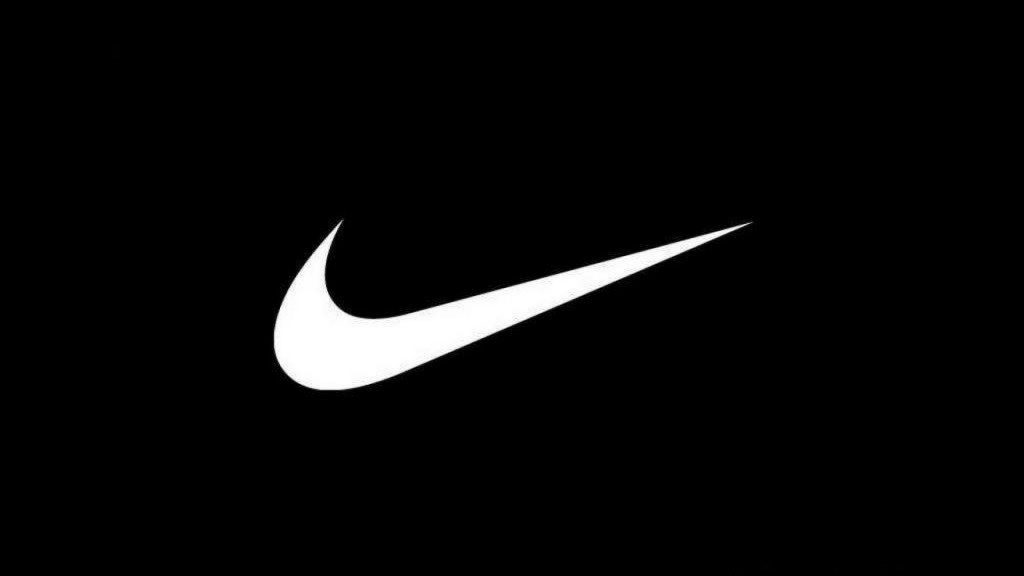
Although it is a little hard to believe, lines can influence our subconscious, causing the concrete perception. Let us remember the famous Nike Swoosh. Few people know, but famous rounded line similar to the umbrella handle expresses nothing else than sportiness and driving. Therefore, using one or another form correctly, you can achieve the desired impression.
- Almost any rounded shape calls emotions. Rings are associated with relationships, marriage, and love. Also, a circle is a symbol of friendship and support. Round forms are ideal for a logo of any public organization or company related to family and home.
- Angular shapes – squares, rhombuses, and triangles – symbolise stability.
- Straight lines are associated with the reliability of the company and its well-thought organization. However, straight lines are too boring, so the best way is to combine them with other elements or just slightly change their slope. Different lines can transmit a completely different meaning. Their direction, incompleteness, and curvature can influence the perception of the logo. For example, horizontal and slightly curved lines are associated with the feminine, tranquility, and peace while vertical lines call for aggression and contain a lot of male energy.
Fonts
Adidas logo is among those whose typeface is made specially for the brand
Of course, the main requirement to the font is readability and easiness of perception. But do not forget about the other criteria which can either smooth or strengthen the result.
- The two most popular fonts are Serifs and Sans-Serifs. They’re not bad for small logos, main text, and headlines since they demonstrate adherence to traditions and professionalism. However, such fonts are severely lacking the uniqueness and brightness.
- If you’re looking for original fonts, the best idea is to create them specially for the logo of your brand. Such fonts are the perfect for creative and luxury companies. But please don’t be too clever by half since the font may seem fussy and be difficult to read, which in turn will show the immaturity of the company.
Problems with readability may occur when using both standard and decorative fonts. To prevent it, make sure the words on your logo can be clearly identified.
Conclusion
Just like every design piece, suffice to say that each part of even the simplest logo has its importance – random, feebly marked, obvious, or subliminal. But it has. For this reason, no logo can be designed in an instant. To get a really good brand, you need to experiment with a search of elements that best express the idea of your business. And the psychology of the development of individual elements is the point to start. With the right approach, separate elements will reflect the company’s objectives, its character, and identity when combined in a splendid logo.
About Brian
Brian Jens is no more a freelancer although it was his passion for many years. A blogger and a designer, Brian finally found himself at DesignContest – one of the leading crowdsourcing platforms in the industry. Brian’s experience in marketing and design is a solid basis to create valuable and in-depth materials. You’re welcome to propose Brian any topics you’re interested in and get an answer very soon. Contact him here.