
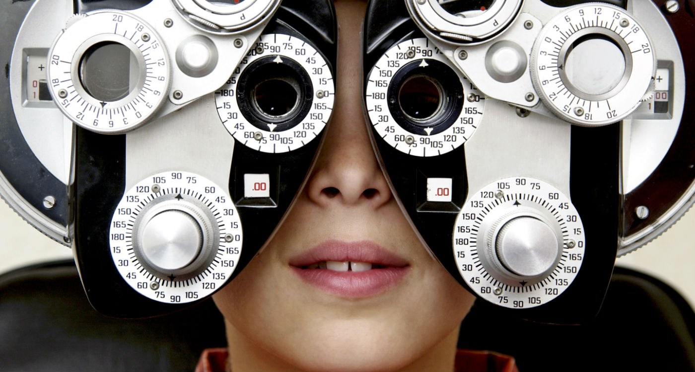
Many of us remember how nervewracking it was in our childhood (or still is) when the optometrist asked us to read the letters off the eye chart, hung neatly in his office while he fitted us with trial lens one after another.
We were terrified of how blind we will end up upon guessing a letter wrong on the eye chart, or often referred to as Snellen chart. The truth is, how thick our glasses shall be does not only depend upon whether we got to say the right letter or not.
There are many factors, interestingly, that also touches on the observations of user experience whenever an optometrist gets you to do an eye exam using the Snellen eye chart.
A brief introduction to Snellen eye chart
Snellen eye chart is used during an eye exam to measure visual acuity (acuteness or clearness of vision) by checking how well you see in comparison to other people. In general, visual acuity is a quantitative measure of the ability to identify black symbols on a white background at a standardised distance as the size of the symbols is varied.
The optometrist will have you seated and fitted with trial lens and have you to look at the eye chart and read the smallest line of text that you can see from 20 feet away. If you see clearly at 20 feet, which is what most people see at that distance, you have 20/20 vision.
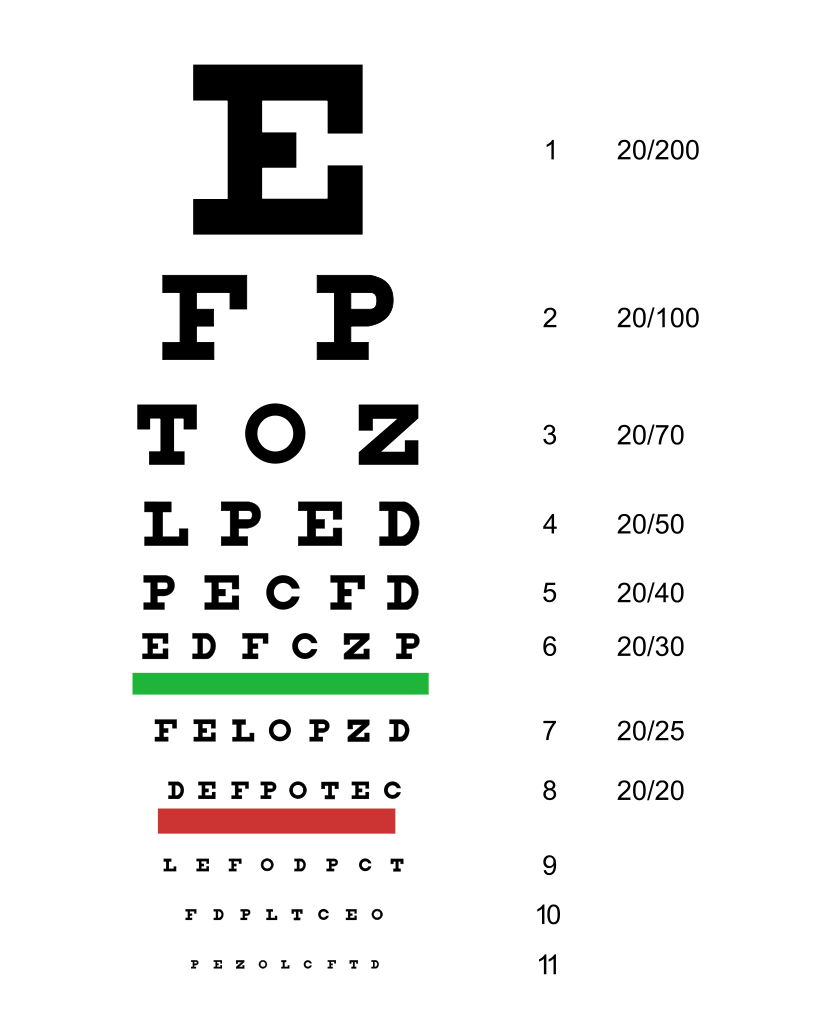
The Snellen eye chart was first designed by a Dutch ophthalmologist, Herman Snellen in 1860s, as a means to improve the subjective nature of vision testing, which was usually accomplished by having patients read a passage of text held their hands, or held at a distance by the doctor.
This test had obvious limitations: the results were dependent upon the reading ability of the patient, the legibility of the typeface used, and the fact that the patient could guess the next word by reading a sentence.
While Snellen chart is the one often used for eye exams, some other charts are used too at times:
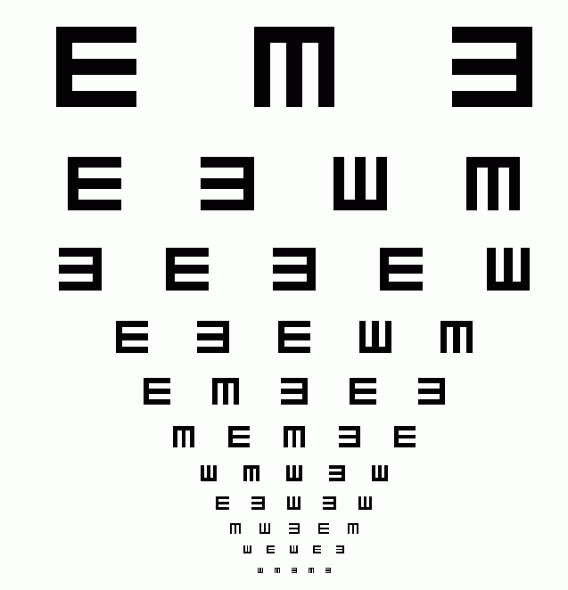
The tumbling E eye chart is used for children that are too small to read or adults with reading or speaking difficulties. The patient is asked to lift their hand up, down, to the left or right depending on the image orientation of the letter E they see on the chart.
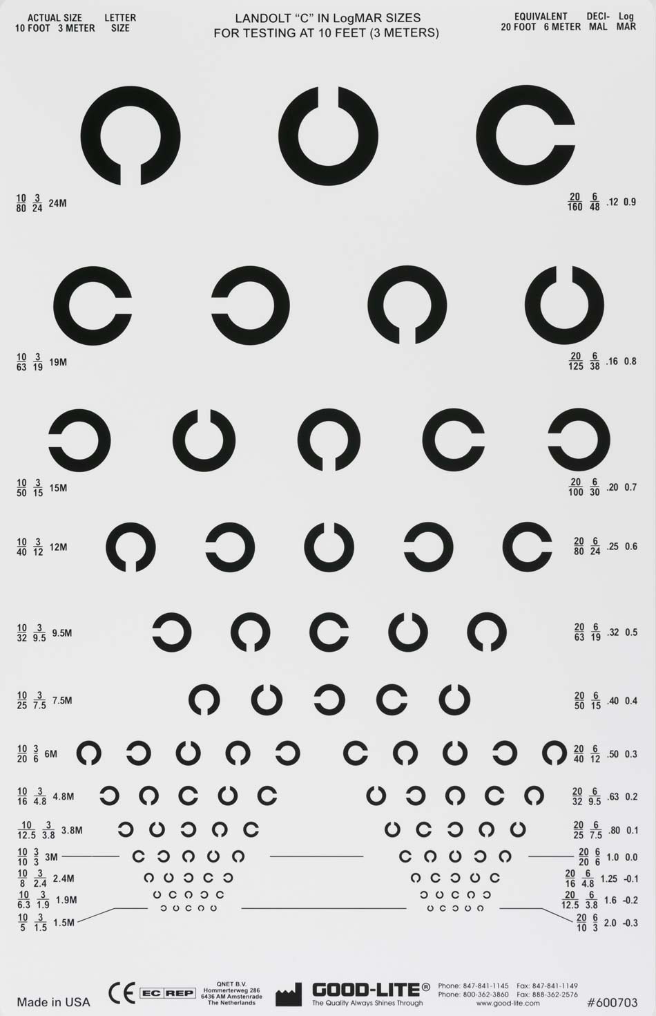
Edmund Landolt, a Swiss ophthalmologist, created this visual acuity chart. This eye chart, which is similar to the Tumbling E chart, uses a Landolt broken ring symbol in various orientations. The Landolt C chart is a way to check vision for illiterate or mute patients.
What can the doctor tell from Snellen eye charts?
At this point, you might be thinking – if it’s just reciting the letters and the charts have the same sequence of letters, I can just memorise and cheat in eye exam! Well, you could – but the eye exam is not to test your memorisation ability. The point is whether you can see it clearly despite the fact that you memorised it.
Furthermore, there is a reason why a Snellen chart is generic – it is because it is intentionally designed so and approved by FDA. Certain letters in the chart help detect astigmatism better – for example the V on the bottom row is often confused for a Y, E can look like B, D looks like O. The font is also very specific and the spacing and thickness of the lines are also scientifically derived.
Another interesting this is doctos also have the chart memorised and are observing the patient carefully and seeing if they’re squinting, tilting their head, slowing down, and many other physical strains you are showing while trying to decide on the letter, and take note of that before prescribing you with your glasses.
Optotypes
Kuchler Chart. Heinrich Küchler is one of the first individuals credited with creating an eye chart to test visual acuity.
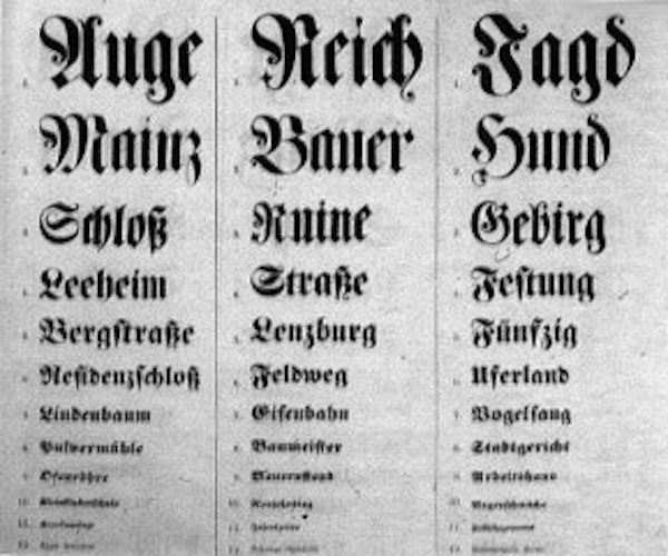
As of now, our design curiosity is already piqued as we see a number of eye charts – what are the typefaces used in these charts though? New York-based designer and lettering artist, Lorrie Frear, has those questions answered as she embarked on an enthralling journey that revealed an eye-opening history of letterforms used and the science behind the designs. Lorrie wrote this after being inspired by her graphic design students’ curiosity about the typeface used in classic eye charts.
Approaching her ophthalmologist for information, Frear discovered the term, “Optotypes”, which refers to the variety of fonts used exclusively in eye chart to achieve an optimal set of results based on clinical setting, patient profile, and diagnostic objective.
Check out the interesting variety of letterform designs in classic eye charts below and read the full article here.
Credits:
- Optotypes:Eye Charts in Focus, I Love Typography
- Top 4 Eye Charts Used During Eye Exams, Stanton Optical
- Why Do Optometrists Use The Same Set of Letters for Eye Exams? Quora
- The Letter Chart, Look After Your Eyes
- An Intriguing Look At The History Of Typefaces Used In Classic Eye Charts, Henry Aquino