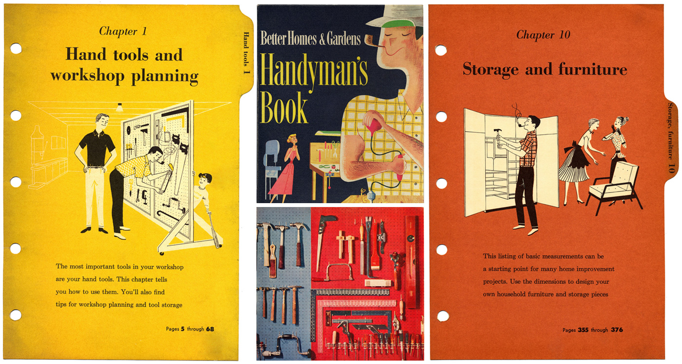
I came across Eudaemonius’s gorgeous series of scans of the 1957’s handybook by Better Homes & Garden. The first thing you notice is the beautiful, vivid colours. Pre-Photoshop, it makes you wonder about the method used to place isolated hand tools on a canary yellow background.
Then there’s the illustration, evocative of the post-war American era when there was an overall feeling of safety, security and abundance. Men started to take pleasure in home improvements and DIY jobs, and housewives with perfectly-coiffed hair gazed adoringly at their beautiful homes (and seem to have a little hero worship going on over their handyman too!).
Also a lesson in typography: keywords were styled in big (sometimes red) fonts but kept inline with the heading. And never more than 1 keyword/phrase communicating the page’s content. People back then don’t have a site-wide search so to access a certain information. They would have relied heavily on table of content. Those with time at hand would perhaps dedicate an entire afternoon of casual browsing. Big bold keywords certainly helped with the linear navigation.
View all of the scans on Flickr.