
In this week’s Curated Friday, someone had the nerves to make a part of a famous monument disappear. Good news: our beloved Red Planet is about to get close and personal, so stay tuned.
This week in art
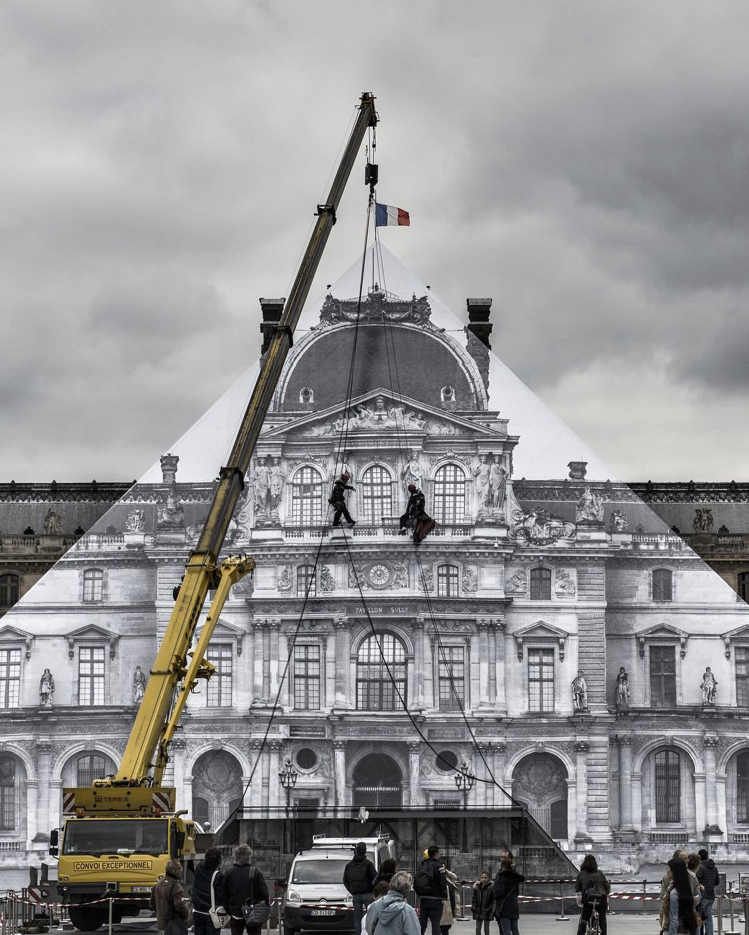
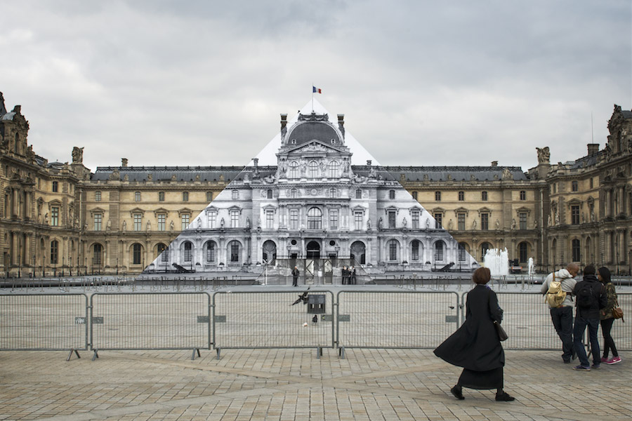
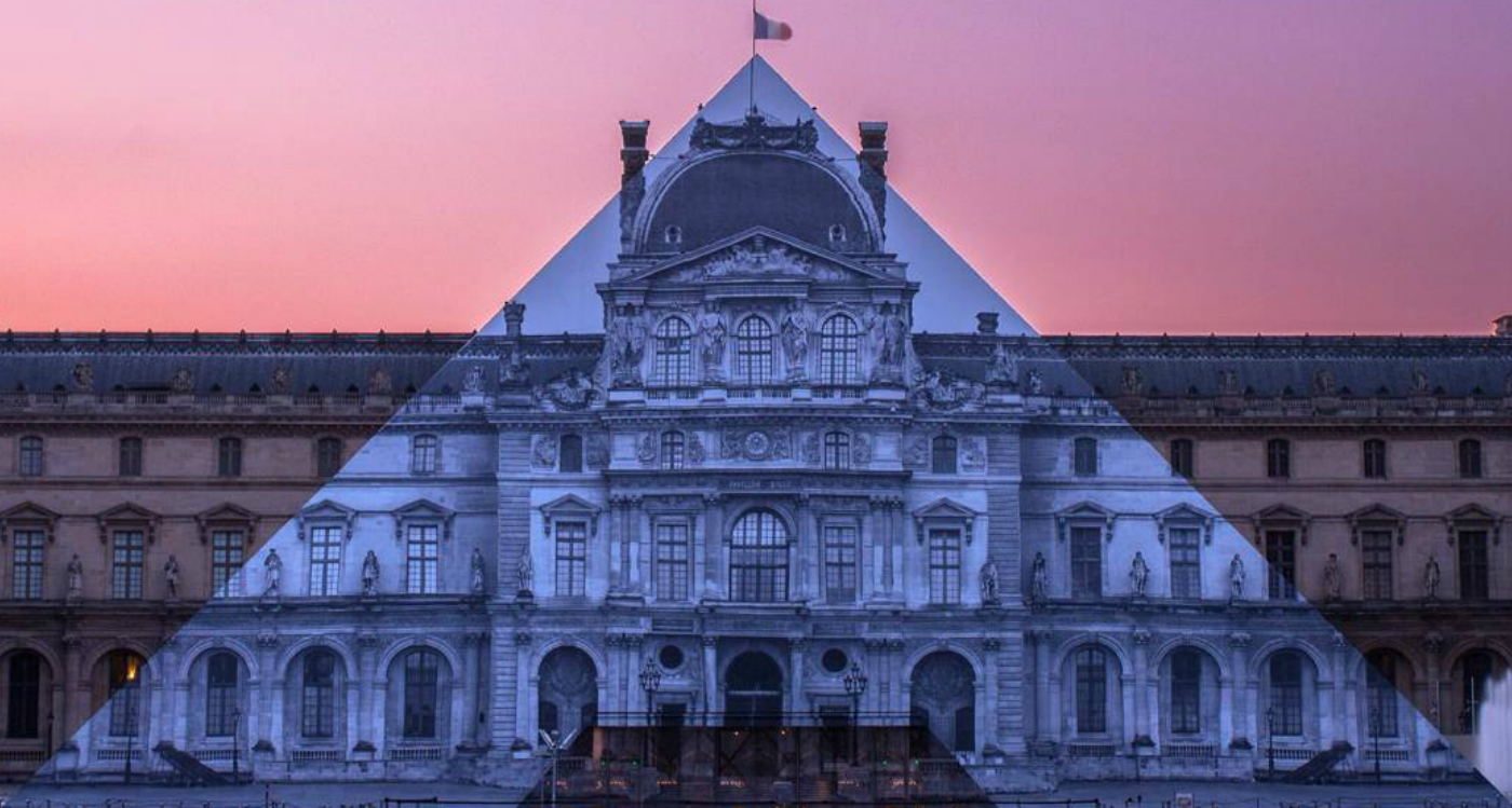
Imagine taking a stroll along the Louvre to find out its massive iconic glass pyramid had disappeared! That exactly what French artist, JR, famous for his silent protest with Darren Aronofsky last year, had done. Covering the glass pyramid with a black and white rendering of the building behind, thus creating the effect that the landmark had disappeared, the installation will be messing with selfie-seeking tourists currently until June 27th.
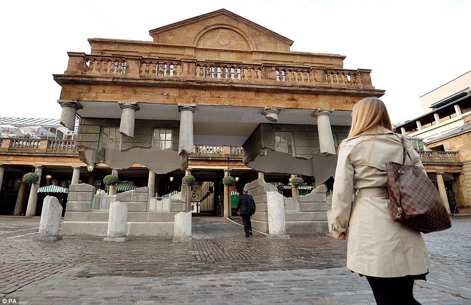
A similar project also took place in London in 2014. British artist, Alex Chinneck has created an artwork at the market place in Covent Garden that makes the facade of the Piazza look like it is floating. The work, called, ‘Take my lightning, but don’t steal my thunder’ used the effect which can be seen from any angle makes the building appear to break away from the columns.
This week in space, and beyond
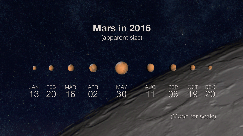
Last May 22, the sun, the Earth, and the planet Mars lined up for a once-in-two-years treat called “the opposition of Mars.” This event is called an “opposition” simply because Mars will be directly opposite the sun in orbit. Mars will be brightest during the opposition, but the next few weeks will be a great time to observe the planet regardless. That’s because Mars will make its closest approach to Earth on May 30 – which is this weekend! Until then, it seems to appear to increase in size in our night sky.
However, you might be able to see very little using an amateur telescope – just probably a hint of the polar cap, and a few dusky shadings. Regardless of this, as the opposition happens every 26 months, this provides a particularly spectacular show as the Red Planet gets as big and as bright as it gets.
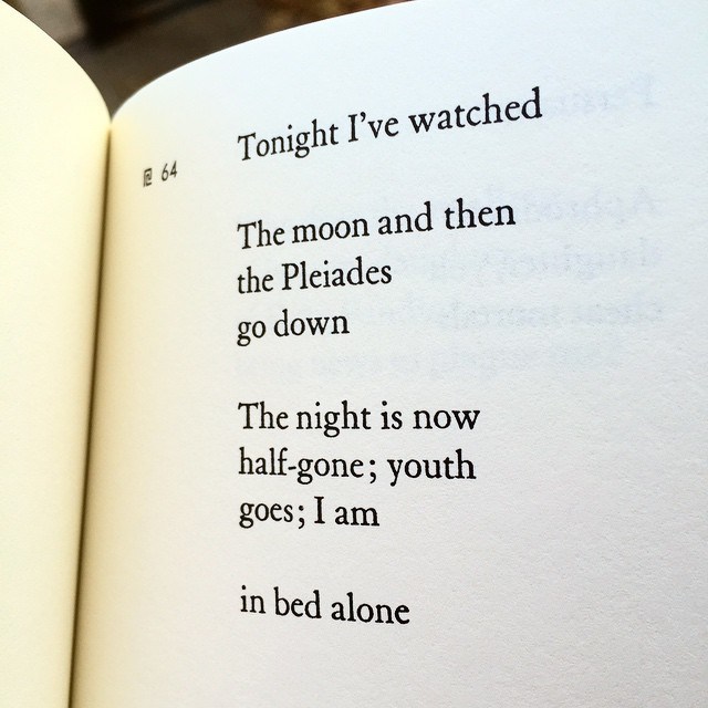
It is very well-known that astronomy and poetry are sometimes intertwined – so it is no surprise, yet pleasant nonetheless – to discover the astronomical specificity in Greek poet Sappho’s poem, Midnight Poem.
In the poem, Sappho talks about the Pleiades, a cluster of extremely bright stars near Taurus. In the poem, she also mentioned as the Pleiades go down, sinking beneath the horizon, which occurs before midnight. Two scientists soon got interested in the poem, because they realised these two facts could be used to determine precisely what time of year Sappho wrote the poem. Working backwards from the year Sappho died (around year 570 BCE), the scientists also used softwares including Starry Night, to visualise the night sky from precisely Sappho’s vantage point.
If you are the type to be easily delighted over these discoveries, you may read the full paper here.
This week in cinema

Speaking of space, have you ever thought about the fate of a man born in outer space? That’s specifically The Space Between Us, opening August 19, is about to address. It’s about the first human born in outer space, thus technically making him an alien—how he deals with that, how humanity deals with that, and a romance that blossoms as a result.
The man, Gardner Elliott finally gets his chance to experience and explore earth, but shortly after arriving, scientists discover that Gardner’s organs can’t withstand Earth’s atmosphere. While it will be tempting to want to view the trailer, here is an advice – don’t. It doesn’t quite give enough on the story (it does, more than enough).
This week in UI/UX
Now there is this trend that we do not want to see it moving towards: making websites look intentionally bad.
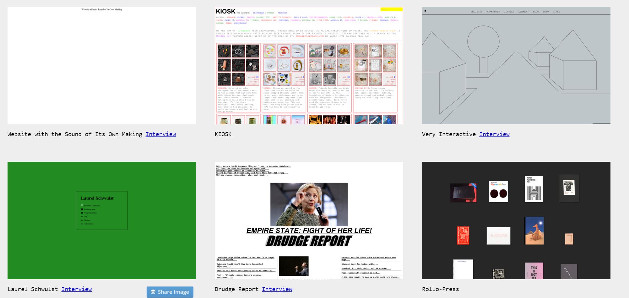
Look at Hacker News. Pinboard. The Drudge Report. Adult Swim. Bloomberg Businessweek features. All of these sites — some years old, some built recently — and hundreds more like them, eschew the templated, user-friendly interfaces that have long been the industry’s best practice. Instead they’re built on imperfect, hand-coded HTML and take their design cues from ’90s graphics.
The name of this school, if you could call it that, is “Web brutalism” and there’s no question that much of the recent interest stems from the work of Pascal Deville, who founded Brutalist Websites. Ian Yates of Envato at the same time, offers his look at brutalist websites and the elements of them, from design, code, font family as well as content strategy.
While Deville says, it may be time to dream up “a new definition of this kind of website,” the folks in UI/UX industry are having a hard time to agree as we live in an age of emotional web design; the age where we as interface and experience designers strive to offer more human-centric approach to our websites as part of the solutions.
We find it hard to agree too. What do you think about this?
This concludes Curated Friday of the week. If you have any suggestions for design news and topics, feel free to drop an email to zana@stampede-design.com. Till next week!